Visualizing a GroupBy (or a Bipartite Graph)
Have you ever needed to present the output of a GroupBy or Pivot Table?
Will you display it as a table? Not everyone can grok it. It will also take time to walk people through the table.
You will format your table with colours (conditional formatting) to show peaks and bottoms. That will work. However, it will become dense as number of rows increase. Furthermore, this workflow involves exporting data from your respective data system (database or data lake) and importing it to Excel/Google Sheets. Thus, it is not feasible in all situations. One of those situations is what I faced.
I was doing an analysis of customer data at work. I wanted to see the distribution of cuisines in two subsequent orders. For example, the customer ordered Chinese food followed by South Indian in the next order. Because sequence matters for my analysis, Chinese to South Indian and South Indian to Chinese would be two separate rows. As you can imagine, a significant part of the GroupBy output contained these redundant pairs. It was difficult to derive any insights from it.
Bipartite Graphs to the Rescue
Fortunately for me, I was able to recall the bipartite graphs. Bipartite graphs model the relationship between two classes of objects. For example, think about the relationship between owners and their cars. An owner can own ore or more cars. An owner can not own other owners. Similarly, a car can not own other cars. A bipartite graph will only show a relationship between a vehicle and its owner (two different classes of objects).
It was perfect for my visualisation problem at hand!
However, to generate a presentable graph turned out to be slightly roundabout. This article is to document the process for my future self.
The Process
As expected, the NetworkX Python library had all the utilities available. The steps are as follows:
- Get data
- Define a
networkx Graph. - Use
bipartite_layout()to define the layout for a bipartite graph. - Draw the graph using
draw().
There are more minor steps involved that we will cover during the deep dive. Since NetworkX plays well with the Matplotlib library, we have all the Matplotlib utilities available to us.
I will visualise the age-wise top causes of death according to WHO.
We start with the necessary imports.
1
2
3
4
5
import random
import pandas as pd
import networkx as nx

from matplotlib import pyplot as plt
We have to pre-process the data for the viz.
1
2
3
4
5
6
7
8
9
10
11
data = pd.read_csv("male.csv").set_index("cod").T
data.columns = ["cod_"+i for i in data.columns]
data = data.rename_axis('age_group').reset_index(drop=False)
data = pd.wide_to_long(
data, stubnames="cod", i=['age_group'], j="cause", sep='_', suffix=r'[\w ,]+'
)
data.columns = ["percent"]
data = data.reset_index(drop=False)
data["percent"] = data["percent"].str[:-1].astype(float)/100
data = data[data.cause != "All Causes"]
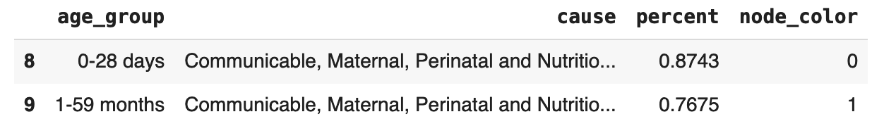
data.head(2)
The data is ready. I wanted all the edges with the same start in the same colour. So I added an integer corresponding to each class using the below code. We will use this column to get a random colour for each label with a colour map.
1
2
3
4
# colors
node_dict = dict([(j, i) for i, j in enumerate(data['age_group'].unique())])
data["node_color"] = data["age_group"].apply(lambda x: node_dict[x])
data.head(2)
I am loading the data and converting the wide to the long format for NetworkX. Next, we define our graph using this data.
1
2
3
4
5
edges = [tuple(x) for x in data[['age_group', 'cause']].values.tolist()]
B = nx.Graph()
B.add_nodes_from(data['age_group'].unique(), bipartite=0)
B.add_nodes_from(data['cause'].unique(), bipartite=1)
B.add_edges_from(edges)
Below is how we visualise the graph.
1
2
3
4
5
6
7
8
9
10
11
# matplotlib variables
fig, ax = plt.subplots()
fig.set_size_inches(9, 6)

# First specify the nodes we want on left or top
# create a bipartite layout
left_or_top = data['age_group'].unique()[::-1]
pos = nx.bipartite_layout(B, left_or_top, scale=10)

# Pass that layout to nx.draw
nx.draw(B, pos, node_color='#A0CBE2', edge_color="white", width=1)
We define Matplotlib variables. Use bipartite_layout to get the required layout and draw the graph. Note that, without edge_color="white", we can stop at this step. We will get equal width, constant colour edges and nodes. The next few steps will fix the presentation aspect of the plot.
We colour the edges first.
1
2
3
4
5
6
7
8
9
10
11
12
13
14
15
16
17
18
19
20
21
# define random color map - https://stackoverflow.com/a/68459848/2650427
colors_ = lambda n: list(
    map(lambda i: "#" + "%06x" % random.randint(0, 0xFFFFFF), range(n)))
colors = colors_(len(data.age_group.unique()))

# draw each edge
edge_width_dict = (
    data[['age_group', "cause", "percent"]]
    .set_index(['age_group', "cause"])
)
for node in data[['age_group', "node_color"]].drop_duplicates().values:
    edges = B.edges([node[0]])
    color = colors[node[1]]
    edge_widths = [edge_width_dict.loc[i]["percent"] for i in edges]
    nx.draw_networkx_edges(
        B,
        pos,
        edgelist=edges,
        width=edge_widths,
        edge_color=color,
    )
We iterate through all the starting nodes and their corresponding colours. We get each point and its edges and colour them the same but vary their width according to the percent column.
Last configuration is the node labels and their alignment. Without this segment, all the node labels would be centre-aligned. A long string is truncated in the viz. I want to point out that neither the documentation nor Stack Overflow could help me here. My saviour was ChatGPT. It gave me a working example using draw_networkx_labels() that I modified as below.
1
2
3
4
5
6
7
8
9
10
11
12
13
14
15
16
17
18
19
20
21
# left node labels alignment
for node_name in data['age_group'].drop_duplicates().values:
    node = {node_name: node_name}
    node_pos = {node_name: pos[node_name]}
    label_pos = nx.draw_networkx_labels(
        B, node_pos, labels=node, font_size=10,
        horizontalalignment='left',
        verticalalignment="bottom"
    )

# right node labels alignment
for node_name in data['cause'].drop_duplicates().values:
    node = {node_name: node_name}
    node_pos = {node_name: pos[node_name]}
    label_pos = nx.draw_networkx_labels(
        B, node_pos, labels=node, font_size=10,
        horizontalalignment='right',
        verticalalignment="bottom"
    )

plt.show()
Our Beautiful Plots
Time to see the results.

Male children mostly die due to Infectious and parasitic diseases, Respiratory infections, Maternal conditions, Neonatal conditions, and Nutritional deficiencies. Most teen and youth deaths (15-29 years in age) happen due to injuries. As men get old, serious ailments (Birth ailments, Cancer, Cardiovascular, Respiratory, and others) become more pronounced causes of death.

Females follow a similar distribution. One notable difference is that relatively few women die due to injuries. Is that the reason women live longer than men?
The plots effectively showed the common diseases for each age group. Of course, this plot only gives a summary. And the summary is what we wanted from this viz.
Shortcomings
The plots were 90% there. Unfortunately, there are a few flaws.
While it provides me with a summary, it does not tell me the strength of the relationship. In that aspect, it is similar to pie charts. And the internet is filled with articles about why pie charts are unhelpful plots.
Another issue is the random colour and edge width assigned to each edge. A node may be yellowish-green in colour. Even if the edge width is relatively higher, the edge will still not be prominent. I re-ran my code to get the version with the right colours. We could solve this by hand-selecting the colours and tuning the edge widths with a constant factor.
Conclusion
We wanted a summary visualisation of our GroupBy (or pivot table) output. To achieve that, we converted it into a bipartite graph and rendered it using Matplotlib.
There are flaws in this visualisation. The strength of the relationship is not apparent. Additionally, edge colour and widths need tuning to make the strong relationships prominent. Fixing these issues is a future work.